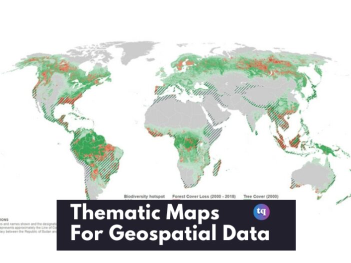
Have you ever seen a map that shows you way more information than you expected? That’s typically what thematic maps do! These maps are like regular maps but with extra information on patterns and trends in geospatial data.
Further, thematic maps are a data visualization technique that effectively show geospatial data. One of the most frequently used are the choropleth maps. However, there are other options apart from choropleth.
And what are they? You’ll find out if you keep reading this article. We’ve reviewed the seven best thematic mapping techniques for you.
Table of Contents
What Are Thematic Maps?
Thematic maps are maps that portray geospatial information in a visual display according to a particular topic or theme.
These types of maps collate relevant information about a specific subject (for example, income distribution, election results, COVID cases, etc.) and display this data spatially.
Or, they can represent this data in respect to its associated local, national, or global area. This enables users to comprehend the relationship between themes alongside their geographic, physical locations.
Although reference maps show features such as terrains and coastlines, and navigation maps enable you to discover your way from point A to point Z, thematic maps concentrate on a specific subject.
What is a Thematic Map Used For?
Thematic maps in AP human geography are used to emphasize trends or patterns and correlations found in geospatial data, alongside for comparing data across multiple locations.
Thus, this makes it easier to comprehend the physical distribution of information on subjects like climate & weather, living things, or human behavior and traits. A thematic map also serves as a visual reference for studying or teaching about relationships in geospatial data.
This allows you to make conclusions that would otherwise be overlooked if you only looked at data in spreadsheets or tables.
Who Uses Thematic Maps?
Thematic maps in AP Hug are typically used by industries that utilize pattern recognition and spatial analysis. Some of these businesses and industries that use thematic mapping include the following:
- Archaeology
- Automotive
- Banking
- Delivery Services
- E-commerce
- Energy & Environment
- Financial Services
- Health Services
- Insurance
- Life Sciences
- Logistics & Transportation
- Retail & Services Sector
- Supply Chain Management
- Urban Planning
7 Best Types of Thematic Maps For Geospatial Data
Different thematic mapping visualizations have different applications. So, we’ll show you the 7 best and most frequently used thematic maps.
1. Choropleth Map
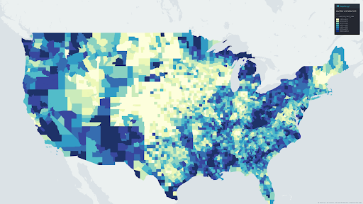
This is one of the most commonly used thematic maps in AP human geography geospatial data. You can use color to depict statistics in relation to its location. For instance, take a look at the United States unemployment rate per county.
From our example, choropleths are typically using colors to show densities. Furthermore, Choropleth maps are used to depict statistical values at various geographic scales, ranging from local to global.
But these maps have a few restrictions. One of them is that geographical spaces are not consistent, hence the shown results may not represent the accurate outcomes. Large geographical areas such as California or Texas, for instance, may dominate the image.
Therefore, normalize the choropleth map attribute to avoid deceptive visuals. A simple method for normalizing this type of map is to divide the statistical values by the population of the geographic area.
2. Bivariate Choropleth Map
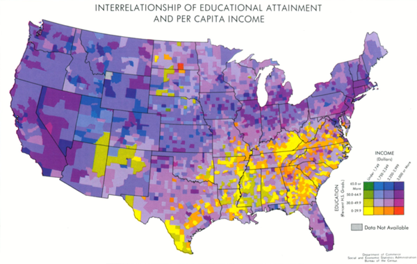
Bivariate choropleth thematic maps in AP Hug share similarities with the choropleths. However, there’s a difference — bivariate choropleths utilize two variables simultaneously to showcase densities, instead of using one variable.
Therefore, it compares two different distributions on the same map. Bivariate choropleth maps work well when you want to show two distinct attributes at the same time.
3. Value-by-Alpha Map
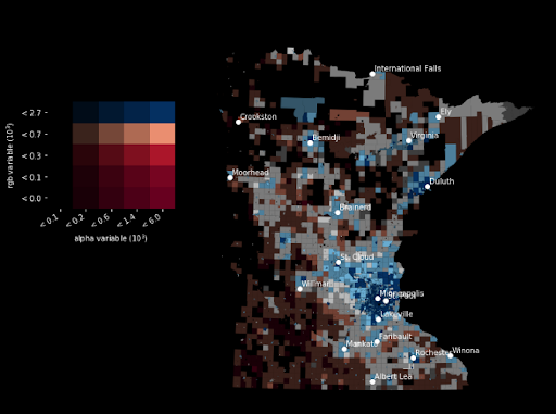
Value-by-alpha (VBA) map is among the examples of thematic maps that’s very similar to the bivariate choropleth. So, value-by-alpha is a bivariate choropleth approach where we evaluate two variables such as population density and election outcomes that influence each other.
The second variable functions as an equalizer for the other variable of interest. Furthermore, the Value-by-alpha map utilizes the alpha variable, which controls transparency, to change the background color.
As a result, greater values stand out while lesser ones disappear into the background. The purpose of VBA maps is to lessen the greater size bias seen in choropleth maps.
4. Dot Density or Dot Distribution Map
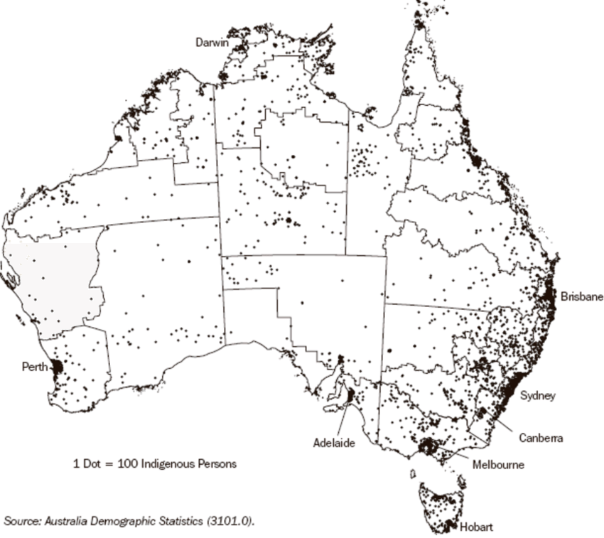
Among the examples of thematic maps in AP human geography is the dot density or dot distribution map. This type of map utilizes dots to show the absence of presence of a feature.
Usually, one point is used to signify a bigger quantity. For instance, take a look at the map above, a single dot signifies 100 indigenous people in Australia.
The above map vividly depicts the spatial pattern of the locations of indigenous people throughout Australia in a simple and concise manner. Meanwhile, remember that the majority of the points are created randomly, meaning they are positioned arbitrarily within the geographic area.
For instance, the points in a rectangle-shaped geographic area may exhibit distinct patterns based on the random selection process. However, it is preferable if the geographic area is smaller.
The metropolitan areas are the geographic area in the Australian example we discussed earlier. On the other hand, the map makes better use of regional borders for visual purposes. If you’re a data scientist, you should be able to interpret this appropriately.
Check Out: How to Drop a Pin on Google Maps
5. Graduated Symbol Map
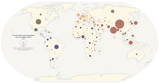
These maps are alternatives to choropleths. What differentiates them is that graduated symbol maps use points rather than color to show feature attributes. The graduated symbol map is otherwise known as the graduated circle map. Most likely, the data was first saved as polygons and subsequently transformed into centroid points for these regions.
If you want to depict quantity instead of density, then this is the type of map you should use. So, you categorize the feature attribute quantities using several classification strategies such as equal intervals, quantile, and natural breaks.
For example, the above graduated symbol map divides the population for certain cities into five categories. And depending on the categorization of the population in that area, each of these categories has a particular dot size. Thus, the graduated symbol map is one of the best examples of thematic maps in AP Hug.
6. Heat Map
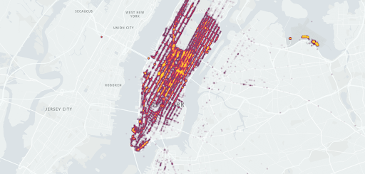
With heat maps, you can see the density of points on a geographic map and imagine (via a color scale) how intense the variable is.
This type of map displays the focus of points and hot spots. Meanwhile, you can employ this strategy when geographic boundaries are irrelevant.
Hence it deserves a spot on our examples/types of thematic maps in AP human geography (Hug).
7. Cartogram
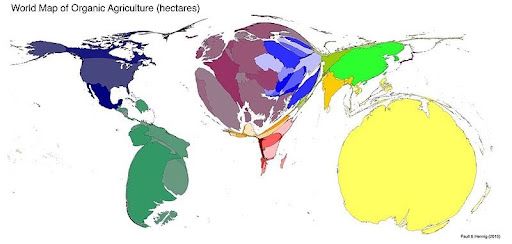
A cartogram is a kind of thematic map where the area’s size is adjusted to correspond with the features it represents. As a result, the rescaled size conveys the chosen feature attributes. Cartograms, therefore, inherently skew area measurements.
Moreover, cartograms are of various types, with the most commonly used being the contiguous cartograms. While you can preserve the topology for contiguous cartograms, the shape is severely distorted.
Bottom Line
Now that you’ve got an arsenal of thematic mapping techniques at your disposal, you can handle any geospatial data challenge. Remember, the best map choice depends on your specific needs.
But with this knowledge, you can become a data visualization expert, converting raw information into clear, compelling maps. And if you’re ever unsure which type of thematic map to use, don’t hesitate to leave a comment below – we’ll be happy to help you out.